17 Terrible Color Schemes That Will Destroy Your Home’s Ambiance
While color psychology suggests that humans can distinguish over 10 million different hues, you’ll find that certain combinations can actually trigger stress responses in your brain.
Even if you’ve spent countless hours planning your home’s aesthetic, choosing the wrong color pairings can instantly sabotage your efforts and create an atmosphere that feels chaotic rather than calming.
You’re probably making some common color mistakes without realizing it, and these mismatched combinations could be affecting everything from your mood to your home’s resale value.
Before you pick up that paint brush, you’ll want to know which color schemes to avoid at all costs.
Hot Pink and Neon Green
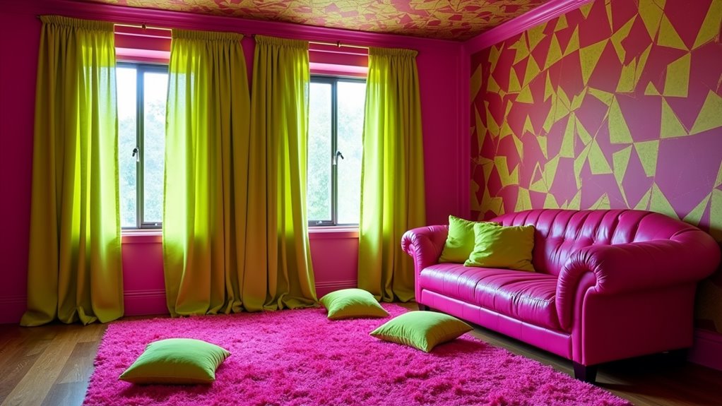
Nearly every interior designer would cringe at the combination of hot pink and neon green in a home’s color scheme.
These aggressive, clashing colors create visual chaos that’ll overwhelm your space and strain the eyes of anyone who enters.
The combination’s intense saturation levels fight for attention, making it impossible to achieve a balanced, harmonious environment.
You’ll find that hot pink’s vivid warmth directly conflicts with neon green’s artificial brightness, creating a jarring effect that can trigger headaches and anxiety.
This pairing doesn’t allow your eyes to rest anywhere in the room, as both colors demand constant attention.
If you’re determined to use either shade, consider incorporating them as small accent pieces instead.
You’ll maintain your desire for bold expression while avoiding the visual assault that comes from combining these intense hues.
Brown and Bright Red
While hot pink and neon green assault your senses, brown and bright red create an equally problematic combination that can turn your living space into a visual battleground.
The earthy heaviness of brown clashes aggressively with bright red’s energetic intensity, producing an unsettling tension that’ll make your room feel both sluggish and chaotic.
You’ll find this combination particularly jarring in larger spaces, where the brown tends to dominate and make rooms feel cramped, while the bright red creates uncomfortable focal points that draw attention to all the wrong places.
The contrast between these colors lacks the sophistication of more balanced pairs, and you’ll notice how it creates an atmosphere that’s simultaneously dated and distressing.
If you’re aiming for a refined, welcoming environment, this combination will actively work against your goals.
Purple and Orange
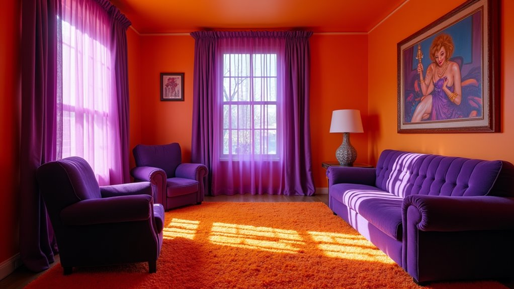
Every designer’s worst nightmare comes to life when purple and orange collide in interior spaces.
These clashing colors create visual tension that’ll make your rooms feel chaotic and unsettling.
Whether you’re using royal purple with tangerine or eggplant with burnt orange, you’re setting yourself up for a jarring combination that fights for attention.
You’ll notice how the warm, energetic orange competes with purple’s cool, regal nature, creating an uncomfortable visual discord.
The effect becomes even more pronounced in larger spaces or when used on opposing walls.
If you’re determined to incorporate these hues, you’ll want to separate them completely into different rooms.
Your best bet is to choose one as an accent color and pair it with neutrals instead of forcing these opposing colors to coexist.
Navy Blue and Forest Green
Despite their individual elegance, navy blue and forest green create a heavy, oppressive combination that can overwhelm any room.
When paired together, these deep, saturated hues compete for dominance, creating a suffocating atmosphere that dampens natural light and closes in your space.
You’ll find yourself struggling with a perpetual sense of darkness, as neither color offers the visual relief your room needs.
If you’re hoping to maintain your design freedom, avoid this restrictive duo.
The intensity of navy blue paired with forest green’s depth creates an unrelenting visual weight that’s difficult to balance, even with lighter accents.
Instead, consider pairing either color with lighter, more harmonious tones.
You’ll preserve the sophistication you’re seeking without sacrificing the open, breathable quality that makes a space truly livable.
Mustard Yellow and Burgundy
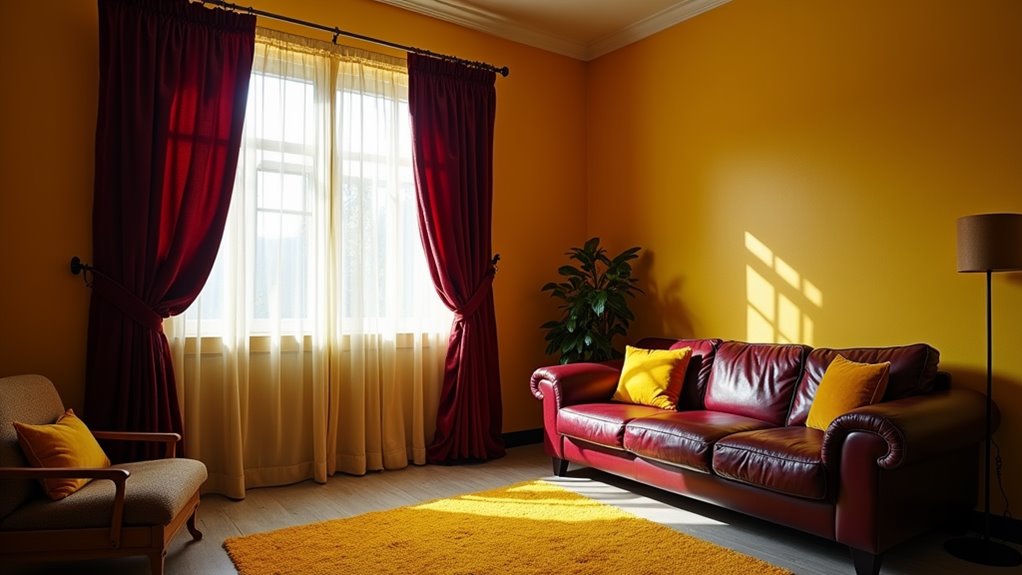
In the domain of dated color combinations, mustard yellow and burgundy stand as remnants of 1970s design mistakes that shouldn’t be revived.
These colors clash aggressively, creating a visually oppressive atmosphere that can make your spaces feel smaller and more confining than they actually are.
When you pair mustard’s muddy undertones with burgundy’s heavy presence, you’ll create a weight that drags down your room’s energy.
The combination feels stuffy and institutional, reminiscent of outdated university libraries and vintage government buildings.
Instead of inspiring creativity and comfort, these colors work against each other, competing for dominance and leaving your space feeling unbalanced.
They’ll overpower any natural light and make it challenging to incorporate other design elements, ultimately limiting your decorating options and personal expression.
Gray on Gray
The monochromatic mistake of layering gray upon gray creates a lifeless, prison-like atmosphere that’ll drain your space of personality.
When you stack charcoal walls against slate furniture and pewter accents, you’re fundamentally designing your own personal isolation chamber.
The lack of contrast makes it difficult for your eyes to distinguish depth and dimension, resulting in a flat, oppressive environment.
You’ll find that this industrial-inspired palette quickly becomes depressing, especially during darker months when natural light is limited.
Even with varying textural elements, an all-gray scheme feels cold and institutional rather than inviting.
To break free from this concrete jungle effect, you’ll need to introduce contrasting colors that spark energy and life.
Don’t let your home become a monotonous maze of grayscale despair.
Lime Green and Electric Blue
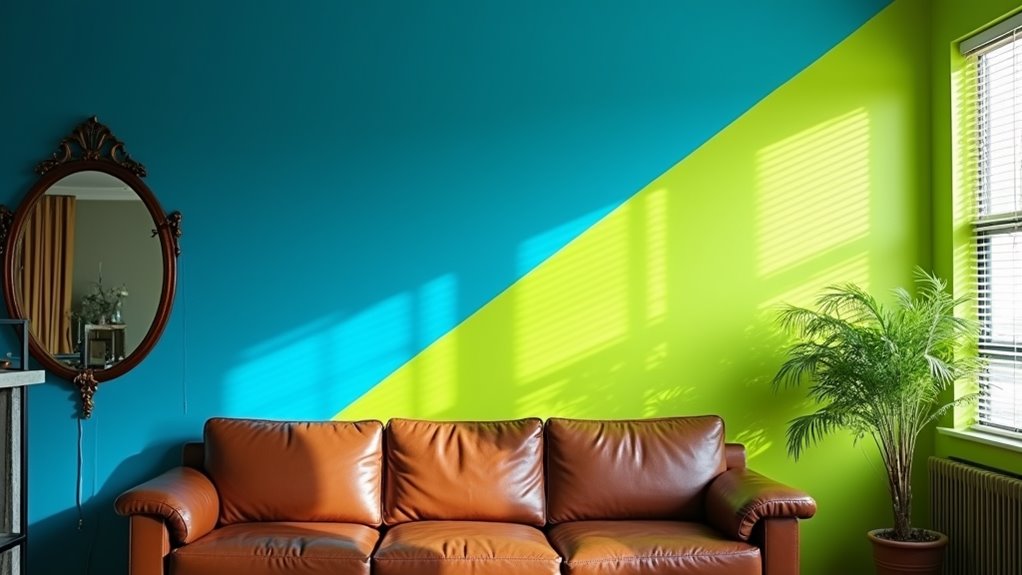
Combining lime green and electric blue throughout your home creates an assaulting visual experience that rivals a 1990s laser tag arena.
These high-intensity colors compete for attention, creating a chaotic environment that’ll make your space feel more like an energy drink advertisement than a livable home.
The harsh contrast between these neon shades can trigger visual fatigue and make it impossible to relax in any room.
You’ll find yourself battling headaches as the colors vibrate against each other, especially in spaces where natural light intensifies their glow.
The combination also dates your interior instantly, making it difficult to incorporate other design elements or resell your home.
If you’re drawn to these hues, you’ll achieve better results by using them as small accent pieces rather than dominant colors in your design scheme.
Rainbow Everything
Once popular during the 1960s counterculture movement, decorating every surface of your home in rainbow colors creates an overwhelming and juvenile aesthetic that lacks sophistication.
While you might feel tempted to express your free spirit through a spectrum of bright hues, covering your walls, furniture, and decor in rainbow patterns will make your space feel like a children’s playroom rather than a mature living environment.
You’ll find that rainbow-themed rooms quickly become visually exhausting, making it difficult to relax or focus.
The constant competition between colors creates visual chaos, and you’ll struggle to establish any sense of harmony or balance.
Instead of going full spectrum, consider choosing one or two bold colors as accents while maintaining a more refined base palette that won’t assault your senses.
Black and Fire Engine Red
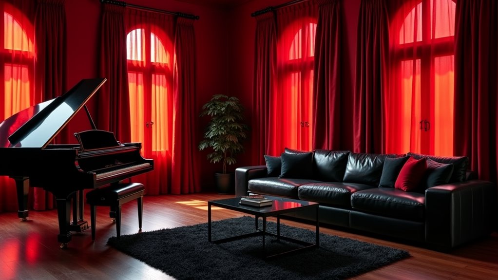
Moving from rainbow chaos to stark contrasts brings us to another problematic pairing: black and fire engine red.
While you might envision a bold, dramatic statement, this harsh combination creates an aggressive, unsettling atmosphere that’ll drain your energy and overwhelm your senses.
The intensity of fire engine red against pure black produces excessive visual tension, making it impossible for your eyes to find a resting point.
You’ll notice this scheme creates a space that feels perpetually “loud” and confrontational.
In living areas, it’ll make relaxation nearly impossible, while in bedrooms, it’ll disrupt your sleep patterns.
If you’re determined to use these colors, consider softening the impact by incorporating charcoal instead of black, or choosing a deeper burgundy rather than bright red.
Bubblegum Pink and Yellow
The saccharine sweetness of bubblegum pink paired with bright yellow creates a jarring visual assault that’ll make your space feel like a kindergarten classroom gone wrong.
This unsophisticated combination overstimulates your senses and diminishes any chance of creating a refined, mature environment.
You’ll find yourself constantly fighting against the cotton-candy chaos that dominates every corner of your room.
Even if you’re aiming for playful or whimsical, this color duo crosses the line into visual exhaustion.
The intense yellow amplifies the artificial quality of bubblegum pink, creating an atmosphere that’s impossible to relax in.
Your walls will practically vibrate with clashing energy, and you’ll struggle to incorporate any décor pieces that don’t get lost in this overwhelming palette.
Save these colors for children’s birthday parties, not your living space.
Bronze and Mint Green
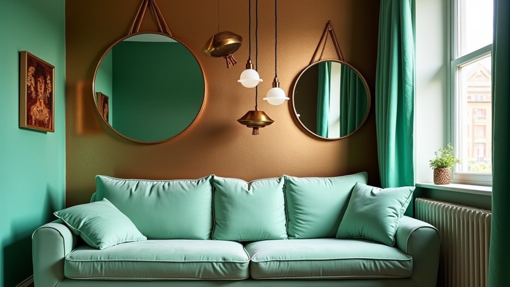
Metallic bronze surfaces clash aggressively with mint green’s pastel coolness, creating an uncomfortable visual tension that’ll leave your space feeling perpetually confused.
When you combine these mismatched elements, you’re fundamentally pitting warm industrial tones against soft, retro-inspired hues that were never meant to coexist.
The reflective quality of bronze creates harsh glares that completely overpower mint green’s soothing nature, while the mint shade makes your bronze fixtures appear dated and dull.
If you’re attempting to incorporate either of these colors, pair bronze with rich earth tones or deep burgundies instead.
For mint green, stick to crisp whites or gentle grays as complementary choices.
Don’t fall into the trap of forcing these opposing colors together – you’ll only end up with a space that feels unsettled and aesthetically jarring.
Royal Purple and Bright Orange
Invariably, combining royal purple with bright orange creates a visually exhausting color scheme that overwhelms any room’s aesthetic balance.
When you pair these two bold, saturated colors, you’re fundamentally forcing competing elements to clash in a constant battle for visual dominance.
Your eyes won’t find a natural resting point, as both hues demand equal attention.
You’ll notice that royal purple’s regal undertones become garish when placed alongside bright orange’s energetic presence.
The combination creates a jarring effect that’s particularly problematic in living spaces and bedrooms where you’re seeking relaxation.
If you’re determined to use either color, you’ll achieve better results by pairing purple with soft gold or orange with deep navy.
These alternatives maintain visual interest without sacrificing the room’s livability or your sanity.
Dark Brown and Dark Green
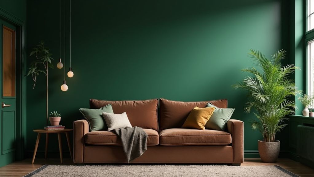
Moving from bright clashes to murky combinations, dark brown paired with dark green creates a heavy, oppressive atmosphere that can make your space feel like a dimly lit forest floor.
You’ll find yourself struggling to distinguish between these two deep tones, especially in corners and shadowy areas where they seem to merge into an indistinct mass.
This combination’s main problem lies in its lack of contrast and visual weight.
When you’re using dark brown furniture against dark green walls, or vice versa, you’re fundamentally creating a space that feels perpetually gloomy and confined.
Natural light gets absorbed rather than reflected, making the room feel smaller and more claustrophobic.
If you want to maintain your freedom of movement and visual clarity, avoid this smothering color duo at all costs.
Teal and Rust
A designer’s nightmare unfolds when teal and rust collide in interior spaces, creating a jarring combination that resembles abandoned industrial sites rather than welcoming homes.
You’ll find that these clashing colors fight for dominance, with teal’s oceanic boldness battling against rust’s weathered earthiness.
While each shade holds its own merit independently, their pairing creates visual tension that’ll leave your rooms feeling perpetually unresolved.
The rust’s oxidized warmth conflicts with teal’s cool sophistication, producing an unsettling discord that makes it impossible to achieve a cohesive design statement.
If you’re tempted to experiment with this combination, you’ll quickly discover that it creates a confused aesthetic, making your space feel like an uncomfortable mix between a maritime museum and a corroded shipyard.
Consider separating these colors into different rooms entirely.
Beige and Pastel Pink
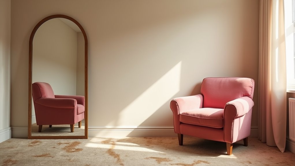
Despite their individual charm, beige and pastel pink create a tepid, lifeless combination that drains energy from your living spaces.
When paired together, these colors produce a dated, institutional feel that resembles retirement homes and outdated medical facilities.
The beige’s neutrality amplifies the pastel pink’s weakness, resulting in walls that appear washed out and lackluster.
You’ll find this combination particularly problematic in living rooms and dining areas, where it can suppress appetite and social interaction.
The pairing lacks the contrast needed to create visual interest or define architectural features.
If you’re aiming for sophistication or trying to express your personality, this duo won’t serve you well.
Instead of settling for this bland partnership, consider incorporating either color separately with more vibrant companions that’ll inject life and character into your home.
Neon Yellow and White
Bright and jarring, neon yellow paired with white creates an overwhelming visual assault that’ll strain your eyes and dominate any room.
This aggressive combination transforms peaceful spaces into anxiety-inducing environments that’ll make you feel like you’re living inside a caution sign or safety vest.
The harsh contrast between these colors prevents visual rest, making it impossible to relax in your own home.
You’ll find yourself squinting constantly, and your guests won’t stay long.
The reflective quality of white amplifies neon yellow’s intensity, bouncing the acidic hue across walls and surfaces with merciless energy.
Even minimal use of this combination, such as in accent pieces or trim work, can overpower your carefully chosen décor and create spaces that feel more like a construction zone than a livable environment.
Red and Baby Blue
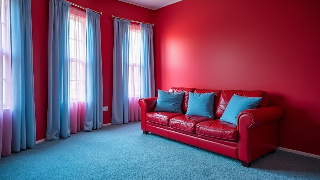
While neon yellow assaults your senses, this next combination brings its own set of design disasters.
Red and baby blue create a jarring visual conflict that’ll make your space feel like a carnival gone wrong.
The intense warmth of red clashes aggressively with the soft, cooling nature of baby blue, producing an unsettling tension in any room.
You’ll find this combination particularly problematic in living spaces and bedrooms, where it disrupts the natural flow of relaxation.
The red demands attention and raises blood pressure, while the baby blue attempts to soothe – resulting in a psychological tug-of-war that leaves you feeling unsettled.
Instead of creating a balanced design statement, this pairing resembles a confused nursery meets emergency room aesthetic that you’ll quickly regret implementing in your home.
FAQs
How Do Lighting Conditions Affect the Intensity of Clashing Color Combinations?
You’ll find that bright, direct lighting intensifies color clashes, while dim or diffused light softens their impact. Natural daylight can dramatically shift how contrasting colors interact throughout different times of day.
Can Color-Correcting Window Films Help Minimize the Impact of Poor Color Schemes?
You’ll find color-correcting window films can soften harsh color combinations by filtering natural light. They’ll reduce UV rays and modify incoming light’s temperature, helping neutralize clashing tones while preserving your design freedom.
What Psychological Effects Do Mismatched Color Combinations Have on Mood and Stress?
When you’re surrounded by clashing colors, you’ll experience increased anxiety, difficulty concentrating, and emotional discomfort. Your brain works harder to process jarring combinations, leading to mental fatigue and heightened stress levels.
How Do Seasonal Changes Influence the Appearance of Contrasting Color Combinations?
You’ll be amazed how dramatically natural light transforms your color combinations throughout the year! Winter’s cool light subdues warm tones, while summer’s golden rays intensify contrasts and make bold pairings pop with incredible vibrancy.
Are There Cultural Differences in Perceiving Certain Color Combinations as Clashing?
You’ll find that color perception varies dramatically across cultures. What’s harmonious in India might clash in Scandinavia. Your own cultural background deeply influences whether you’ll view certain combinations as complementary or conflicting.
Final Thoughts
You’ve likely heard that “any color combination can work if done right.”
Well, that’s a designer’s fairy tale. The harsh reality is that some color pairings will wreck your home’s aesthetic, no matter how skillfully you try to blend them.
Instead of gambling with clashing combinations that’ll haunt your space, embrace tried-and-true palettes that create harmony.
Your home deserves better than becoming a cautionary tale in color theory.