11 Embarrassing Decorating Faux Pas You’re Probably Making
You’ve spent countless hours curating your living space, yet something still feels off.
Despite your best efforts, you might be falling into common decorating traps that even seasoned homeowners make.
From artwork floating awkwardly high on walls to the matching furniture sets that scream “showroom floor,” these design missteps can quietly undermine your home’s potential.
While you may think you’re making safe choices, these unintentional faux pas could be the very reason your space isn’t achieving the polished, professional look you’re after.
Let’s explore the most common decorating mistakes and, more importantly, how to fix them.
Hanging Artwork Too High
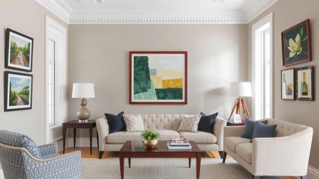
Interior designers cringe when they spot artwork floating awkwardly above eye level.
You’ve likely seen this common mistake in homes: paintings and prints hovering so high they’re practically touching the ceiling.
The rule of thumb is simple – artwork should be hung at average eye level, with the center point positioned approximately 57-60 inches from the floor.
When you’re hanging pieces above furniture like sofas or consoles, maintain 6-8 inches of breathing space between the furniture and frame’s bottom edge.
For gallery walls, treat the entire arrangement as one unit, centering the grouping at eye level.
Don’t let tall ceilings tempt you into raising artwork – proper height creates visual harmony and allows viewers to appreciate the details without straining their necks.
Matching Furniture Sets
While proper artwork placement creates visual interest, buying complete matching furniture sets can have the opposite effect.
Your living space ends up looking like a furniture showroom – predictable, uninspired, and devoid of personality.
Instead, opt for coordinated pieces that complement each other without being identical twins.
Mix materials, textures, and finishes to create depth and visual intrigue.
Pair a leather sofa with velvet accent chairs, or combine wooden end tables of different tones.
You’ll achieve a more sophisticated, curated look that reflects your individual style.
Don’t feel confined by what manufacturers package together – break free from the matching mindset.
The key is to maintain cohesion through common elements like color palette, scale, or style while incorporating enough variety to keep the space dynamic and engaging.
Poor Lighting Placement
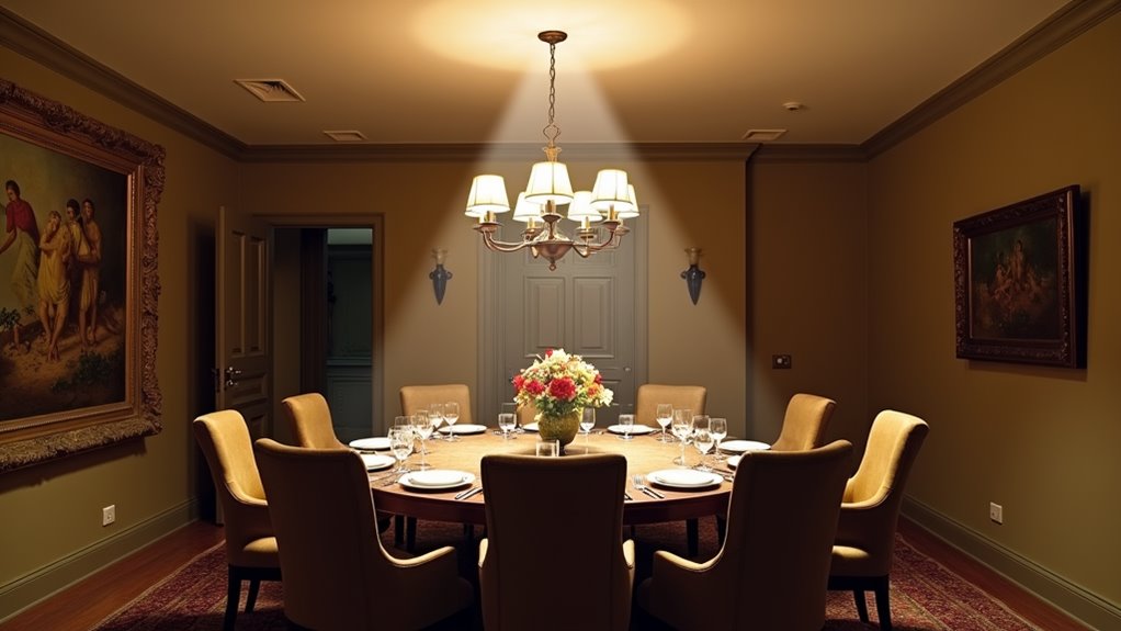
Many homeowners sabotage their spaces with poorly positioned lighting fixtures that create harsh shadows, uneven illumination, or fail to highlight architectural features.
You’re probably guilty of relying solely on overhead lighting, which casts unflattering shadows and creates a stark, institutional feel.
Or maybe you’ve placed table lamps too far apart, creating dark zones that make your room feel disconnected and unwelcoming.
Instead, layer your lighting at different heights and angles.
Position floor lamps behind seating areas for ambient light, install sconces at eye level to eliminate shadows, and use task lighting for reading nooks and workspaces.
Don’t forget to highlight artwork and architectural details with accent lighting.
By strategically placing light sources, you’ll create depth, warmth, and visual interest while maintaining functionality in every room.
Pushing Furniture Against Walls
Homeowners consistently fall into the trap of pushing all their furniture flush against walls, creating a rigid, bowling-alley effect that wastes valuable space and kills conversation flow.
You’re missing out on the opportunity to create intimate seating arrangements and dynamic focal points that make your space more inviting.
Instead, try floating your sofa away from the wall with a slim console table behind it, or angle your favorite armchair toward the center of the room.
You’ll instantly create cozy conversation areas and improve traffic flow.
For larger rooms, consider creating multiple seating zones by positioning furniture in collaborative clusters.
A well-placed area rug can anchor these arrangements, while strategic placement of side tables and lamps will make these floating furniture islands both functional and aesthetically pleasing.
Ignoring Scale and Proportion
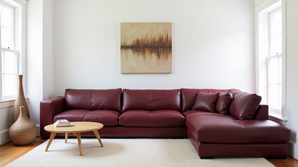
A fundamental mistake in interior design is mismatching the size of furniture and décor pieces with your room’s dimensions.
You’re sabotaging your space when you squeeze an oversized sectional into a tiny living room or float a petite coffee table in front of a massive sofa.
The result? A room that feels awkward and unbalanced.
To nail the proportions, follow the 2/3 rule: your sofa shouldn’t exceed two-thirds of your wall length, and your coffee table should be two-thirds the length of your sofa.
Don’t forget height ratios – your side tables should align with your sofa’s arm height, while pendant lights should hang at eye level when seated.
When selecting artwork, it should span at least two-thirds of the furniture piece it’s anchoring.
Floating Rugs Without Purpose
Why do perfectly good rugs end up looking like lost islands in a sea of hardwood?
It’s often because you’re placing them without considering their relationship to your furniture arrangement.
A rug should anchor your seating area, not float aimlessly in space.
Your rug needs to connect with your furniture pieces – at least the front legs of sofas and chairs should rest on it.
In larger rooms, you’ll want all furniture legs on the rug, while smaller spaces might allow for just the front legs.
Don’t let your rug drift solo in the middle of the room or hover uncertainly under a coffee table.
Instead, use it to define conversation areas and create visual boundaries.
Remember: a well-placed rug acts as the foundation that ties your entire room’s composition together.
Neglecting Window Treatments
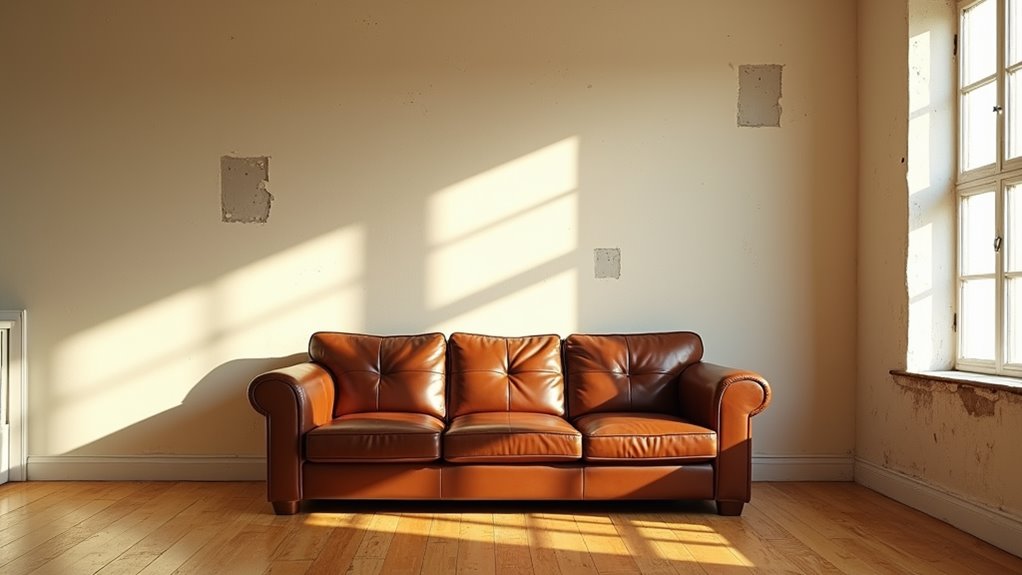
Just as bare floors benefit from well-placed rugs, naked windows can make even the most thoughtfully decorated room feel unfinished.
Window treatments aren’t just decorative elements – they’re essential components that control light, provide privacy, and add architectural interest to your space.
You’re missing out on a prime opportunity to enhance your room’s aesthetic when you leave windows bare or merely hang basic blinds.
Instead, consider layering treatments with light-filtering sheers beneath heavier drapes, or opt for Roman shades that add texture while maintaining clean lines.
Don’t forget to hang your curtains high and wide – extending them well beyond the window frame creates the illusion of larger windows and higher ceilings.
The right window treatments can transform your space from looking like a temporary rental to a carefully curated home.
Cluttered Open Shelving
Open shelving may showcase your favorite pieces, but overcrowding these displays can quickly transform an elegant storage solution into visual chaos.
When you’re cramming every inch with mismatched items, you’re creating a cluttered, anxiety-inducing space that defeats the purpose of this trendy design choice.
To master open shelving, embrace negative space and curate your collections thoughtfully.
Group similar items by color, size, or function, and leave breathing room between displays.
You’ll want to stick to a 70% occupancy rule – keeping 30% of your shelves clear creates visual balance. Don’t feel pressured to fill every shelf just because it’s there.
Instead, rotate your displayed pieces seasonally to maintain interest while preventing dust-collecting overcrowding.
Forgetting The Fifth Wall
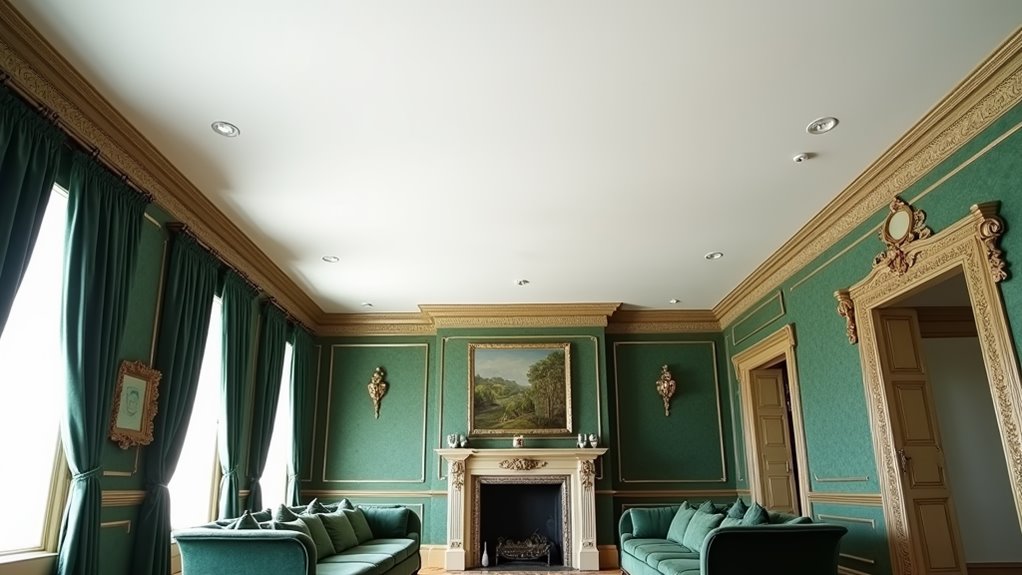
Many homeowners overlook the ceiling – your room’s fifth wall – when planning their interior design scheme.
This blank canvas above offers endless possibilities to elevate your space’s visual appeal.
From bold wallpaper and architectural details to painted patterns and exposed beams, your ceiling can transform a room from ordinary to extraordinary.
Consider extending wall colors onto the ceiling to create a cocooning effect, or make a statement with contrasting hues that draw the eye upward.
You’ll find that metallic finishes, textured treatments, and even fabric installations can add depth and drama to your space.
In smaller rooms, a glossy ceiling finish reflects light and creates the illusion of height, while in larger spaces, dark ceiling colors can make the room feel more intimate and purposeful.
Mismatched Wood Tones
One of the most glaring design mistakes occurs when homeowners randomly mix wood tones without considering their undertones and grain patterns.
You’ll notice the discord when your oak flooring clashes with cherry cabinets, while mahogany furniture fights for attention against walnut shelving.
It’s a visual cacophony that disrupts your room’s harmony.
To master wood mixing, you’ll want to stick to a maximum of three wood tones in a single space.
Choose pieces that share similar undertones – whether warm or cool – and vary the grain patterns strategically.
If you’re working with existing wood elements, try unifying mismatched pieces by staining them to complement each other.
Empty Corner Spaces
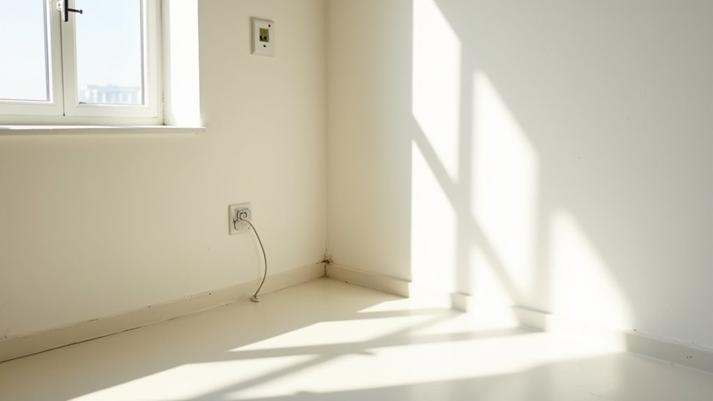
Corner dead zones frequently become forgotten territories in otherwise well-designed rooms.
These neglected spaces create visual imbalance and make your room feel unfinished, like an incomplete design puzzle.
You’re missing prime opportunities to add depth, personality, and functionality to your space.
Transform these blank corners into purposeful vignettes by incorporating tall plants, floor lamps, or corner shelving units.
A cozy reading nook with a comfortable chair, side table, and task light can turn a lifeless corner into your favorite spot.
For tight spaces, consider floating corner shelves, mounted planters, or a sleek corner desk.
Don’t let vertical space go to waste – try stacking decorative elements at varying heights.
Remember, every corner presents a chance to extend your design story and maximize your room’s potential.
FAQs
How Do I Decorate With Bold Patterns Without Making the Room Feel Overwhelming?
You’ll master bold patterns by choosing one statement piece as your focal point. Mix it with solid neutrals and smaller-scale patterns in similar colors. Don’t overdo it—let your showstopper pattern breathe in the space.
What’s the Ideal Budget Percentage to Allocate for Home Decor Accessories?
You’ll want to reserve 10-15% of your room’s budget for accessories. Just like fashion’s finishing touches, these decor elements transform your space from basic to brilliant while maintaining financial flexibility.
How Often Should Seasonal Decorative Elements Be Rotated Throughout the Year?
You’ll want to refresh your seasonal décor four times a year, aligning with nature’s rhythm. Don’t feel confined – switch up accent pieces monthly if you’re feeling inspired. It’s your space to express yourself!
Which Paint Finishes Work Best for Different Rooms and Wall Textures?
“Different strokes for different folks” rings true with paint! You’ll want eggshell for living spaces, satin for kitchens/baths, flat for ceilings, and semi-gloss for trim. Smooth walls handle any finish beautifully.
When Is It Appropriate to Mix Metallic Finishes in Room Decor?
You can confidently mix metallics when you maintain a dominant finish (about 60%) and add 1-2 complementary metals as accents (40%). Just keep finishes in similar warm or cool families for cohesion.
Final Thoughts
Your home’s a canvas waiting to shine, and now you’re armed with design wisdom to dodge those all-too-common decorating pitfalls.
Like a masterful conductor leading an orchestra, you’ll create spaces where every element plays in perfect harmony.
From artfully placed paintings to thoughtfully layered lighting, you’re ready to transform your rooms from design mishaps into sophisticated sanctuaries that’ll make even the most discerning style mavens take notice.